css三栏布局的8种方案
css多栏布局
题目:
假设高度已知,请写出三栏布局,其中左栏、右栏宽度各为300px,中间自适应
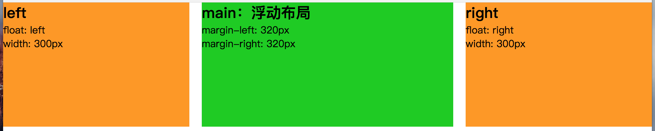
float + margin 布局
float + margin 布局 原理说明:
设置两个侧栏分别向左向右浮动,中间列通过外边距给两个侧栏腾出空间,中间列的宽度根据浏览器窗口自适应。
float + margin 布局 步骤:
-
对两边侧栏分别设置宽度,并对左侧栏添加左浮动,对右侧栏添加有浮动。
-
对主面板设置左右外边距,margin-left的值为左侧栏的宽度,margin-right的值为右侧栏的宽度。
result display
1
2
3
4
5
6
7
8
9
10
11
12
13
14
15
16
17
18
19
20
21
22
23
24
25
26
27
28
29
30
31
32
33
34
35
36
37
38
39
40
41
42
43
44
45
46
47
48
49
50
<!DOCTYPE html>
<html lang="en">
<head>
	<meta charset="UTF-8">
	<title>test</title>
<style>
*{
	margin: 0;
	padding: 0;
}
#left, #main, #right {
	height: 200px;
}
#left {
	float: left;
	width: 300px;
	background: #f90;
}
#main {
	margin-left: 320px;
	margin-right: 320px;
	background: #00cd00;
}
#right {
    float: right;
	width: 300px;
	background: #f90;
}
</style>
</head>
<body>
	<div id="content">
		<div id="left">
			<h2>left</h2>
			<p>float: left</p>
			<p>width: 300px</p>
		</div>
		<div id="right">
			<h2>right</h2>
			<p>float: right</p>
			<p>width: 300px</p>
		</div>
	    <div id="main">
	    	<h2>main:浮动布局</h2>
	    	<p>margin-left: 320px</p>
	    	<p>margin-right: 320px</p>
	    </div>
	</div>
</body>
</html>
float + margin 布局 notice:
DOM文档的书写顺序,先写两侧栏,再写主面板,更换后则侧栏会被挤到下一列(圣杯布局和双飞翼布局都会用到)。 这种布局方式比较简单明了,但缺点是渲染时先渲染了侧边栏,而不是比较重要的主面板,当页面内容较多时会影响用户体验
float + margin 布局的优缺点
- 优点:简单,兼容性好
- 缺点:局限性,脱离文档,影响周边元素,需要清除浮动
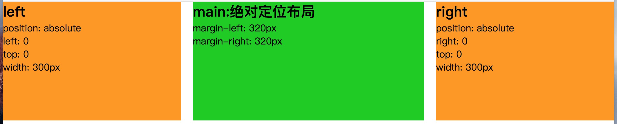
position + margin 布局
position + margin 布局 原理说明:
通过绝对定位将两个侧栏固定,同样通过外边距给两个侧栏腾出空间,中间列自适应。
position + margin 布局 步骤:
-
对两边侧栏分别设置宽度,设置定位方式为绝对定位。
-
设置两侧栏的top值都为0,设置左侧栏的left值为0, 右侧栏的right值为0。
-
对主面板设置左右外边距,margin-left的值为左侧栏的宽度,margin-right的值为右侧栏的宽度。
result display
1
2
3
4
5
6
7
8
9
10
11
12
13
14
15
16
17
18
19
20
21
22
23
24
25
26
27
28
29
30
31
32
33
34
35
36
37
38
39
40
41
42
43
44
45
46
47
48
49
50
51
52
53
54
55
56
57
<!DOCTYPE html>
<html lang="en">
<head>
	<meta charset="UTF-8">
	<title>test</title>
<style>
*{
	margin: 0;
	padding: 0;
}
#left, #main, #right {
	height: 200px;
}
#left {
	position: absolute;
	left: 0;
	top: 0;
	width: 300px;
	background: #f90;
}
#main {
	margin: 0 320px;
	background: #00cd00;
}
#right {
    position: absolute;
    right: 0;
    top: 0;
	width: 300px;
	background: #f90;
}
</style>
</head>
<body>
	<div id="content">
		<div id="left">
			<h2>left</h2>
			<p>position: absolute</p>
			<p>left: 0</p>
			<p>top: 0</p>
            <p>width: 300px</p>
		</div>
		<div id="main">
	    	<h2>main:绝对定位布局</h2>
	    	<p>margin-left: 320px</p>
	    	<p>margin-right: 320px</p>
	    </div>
		<div id="right">
			<h2>right</h2>
			<p>position: absolute</p>
			<p>right: 0</p>
			<p>top: 0</p>
            <p>width: 300px</p>
		</div>
	</div>
</body>
</html>
绝对定位布局的优缺点
- 优点:快捷、兼容性好
- 缺点:使子元素也脱离文档流,可使用性差
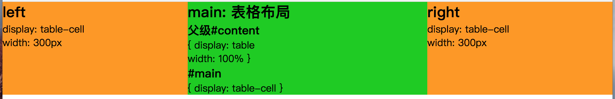
table + table-cell 布局
result display
1
2
3
4
5
6
7
8
9
10
11
12
13
14
15
16
17
18
19
20
21
22
23
24
25
26
27
28
29
30
31
32
33
34
35
36
37
38
39
40
41
42
43
44
45
46
47
48
49
50
51
52
53
<!DOCTYPE html>
<html lang="en">
<head>
	<meta charset="UTF-8">
	<title>test</title>
<style>
*{
	margin: 0;
	padding: 0;
}
#content{
	display: table;
	width: 100%;
}
#left, #main, #right {
	display: table-cell;
}
#left {
	width: 300px;
	background: #f90;
}
#main {
	background: #00cd00;
}
#right {
	width: 300px;
	background: #f90;
}
</style>
</head>
<body>
	<div id="content">
		<div id="left">
		    <h2>left</h2>
		    <p>display: table-cell</p>
		    <p>width: 300px</p>
	    </div>
		<div id="main">
			<h2>main: 表格布局</h2>
			<h3>父级#content</h3>
		    <p>{ display: table-cell</p>
		    <p>width: 100% }</p>
		    <h3>#main</h3>
		    <p>{ display: table-cell }</p>
		</div>
		<div id="right">
			<h2>right</h2>
		    <p>display: table-cell</p>
		    <p>width: 300px</p>
		</div>
	</div>
</body>
</html>
table + table-cell 布局的优缺点
- 优点:布局优先,加速table渲染
- 缺点:1、无法设置栏间距;2、IE7-不支持 display:table 和 display:table-cell;
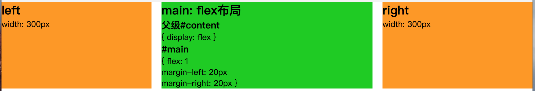
flex 布局
result display
1
2
3
4
5
6
7
8
9
10
11
12
13
14
15
16
17
18
19
20
21
22
23
24
25
26
27
28
29
30
31
32
33
34
35
36
37
38
39
40
41
42
43
44
45
46
47
48
49
50
51
52
53
<!DOCTYPE html>
<html lang="en">
<head>
	<meta charset="UTF-8">
	<title>test</title>
	<style>
	*{
		margin: 0;
		padding: 0;
	}
	#content {
		display: flex;
	}
	#left {
		width: 300px;
		/*flex: 0 1 300px;*/
		background: #f90;
	}
	#main {
		flex: 1;
		margin-left: 20px;
		margin-right: 20px;
		background: #00cd00;
	}
	#right {
		width: 300px;
		/*flex: 0 1 300px;*/
		background: #f90;
	}
	</style>
</head>
<body>
	<div id="content">
		<div id="left">
		    <h2>left</h2>
		    <p>width: 300px</p>
	    </div>
		<div id="main">
			<h2>main: flex布局</h2>
			<h3>父级#content</h3>
		    <p>{ display: flex }</p>
		    <h3>#main</h3>
		    <p>{ flex: 1 </p>
		    <p>  margin-left: 20px </p>
		    <p>  margin-right: 20px }</p>
		</div>
		<div id="right">
			<h2>right</h2>
		    <p>width: 300px</p>
		</div>
	</div>
</body>
</html>
flex布局的优缺点
- 优点:简单实用,未来的趋势; 移动端完美布局
- 缺点:IE8-不支持flex;且flex性能较差,只适合小范围、结构简单的布局。
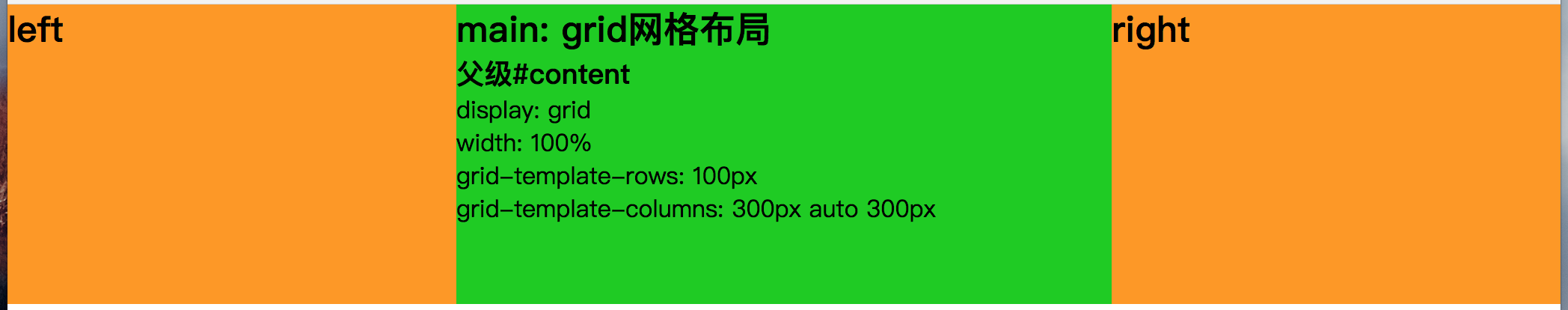
Grid 网格布局
result display
1
2
3
4
5
6
7
8
9
10
11
12
13
14
15
16
17
18
19
20
21
22
23
24
25
26
27
28
29
30
31
32
33
34
35
36
37
38
39
40
41
42
43
44
45
46
<!DOCTYPE html>
<html lang="en">
<head>
	<meta charset="UTF-8">
	<title>test</title>
<style>
*{
	margin: 0;
	padding: 0;
}
#content{
	display: grid;
	width: 100%;
	grid-template-rows: 200px;
	grid-template-columns: 300px auto 300px;
}
#left {
	background: #f90;
}
#main {
	background: #00cd00;
}
#right {
	background: #f90;
}
</style>
</head>
<body>
	<div id="content">
		<div id="left">
		    <h2>left</h2>
		</div>
		<div id="main">
			<h2>main: grid网格布局</h2>
			<h3>父级#content</h3>
		    <p> display: grid </p>
		    <p> width: 100% </p>
		    <p> grid-template-rows: 200px </p>
		    <p> grid-template-columns: 300px auto 300px </p>
		</div>
		<div id="right">
			<h2>right</h2>
		</div>
	</div>
</body>
</html>
Grid网格布局的优缺点
- 优点:CSS Grid 布局是 Web 的第一个真正的布局系统
- 缺点:浏览器兼容性,还未被正式普及
更多 Grid网格布局
- https://developer.mozilla.org/zh-CN/docs/Web/CSS/CSS_Grid_Layout/Basic_Concepts_of_Grid_Layout
- https://juejin.im/entry/5894135c8fd9c5a19507f6a1
- https://www.w3cplus.com/css3/what-is-css-grid-layout.html
- https://zhuanlan.zhihu.com/p/26757425
BFC布局 (float + overflow)
原理:
BFC 区域,不会与浮动元素重叠
result display

1
2
3
4
5
6
7
8
9
10
11
12
13
14
15
16
17
18
19
20
21
22
23
24
25
26
27
28
29
30
31
32
33
34
35
36
37
38
39
40
41
42
43
44
45
<!DOCTYPE html>
<html lang="en">
<head>
<style>
* {
	margin: 0;
	padding: 0;
}
#left {
    float: left;
    width: 300px;
    background: #f90;
}
#right {
	float: right;
    width: 300px;
    background: #f90;
}
#main {
    overflow: hidden;
    margin:0 320px;
    background: #00cd00;
}
</style>
</head>
<body>
	<div id="content">
		<div id="left">
		    <h2>left</h2>
		    <p> float: left </p>
		    <p> width: 300px </p>
	    </div>
		<div id="right">
			<h2>right</h2>
			<p> float: right </p>
		    <p> width: 300px </p>
		</div>
		<div id="main">
			<h2>main: BFC布局</h2>
		    <p> overflow: hidden </p>
		    <p> margin:0 320px </p>
		</div>
	</div>
</body>
</html>
BFC布局优缺点
- 优点:触发BFC
- 缺点:主要内容模块无法最先加载,当页面中内容较多时会影响用户体验。
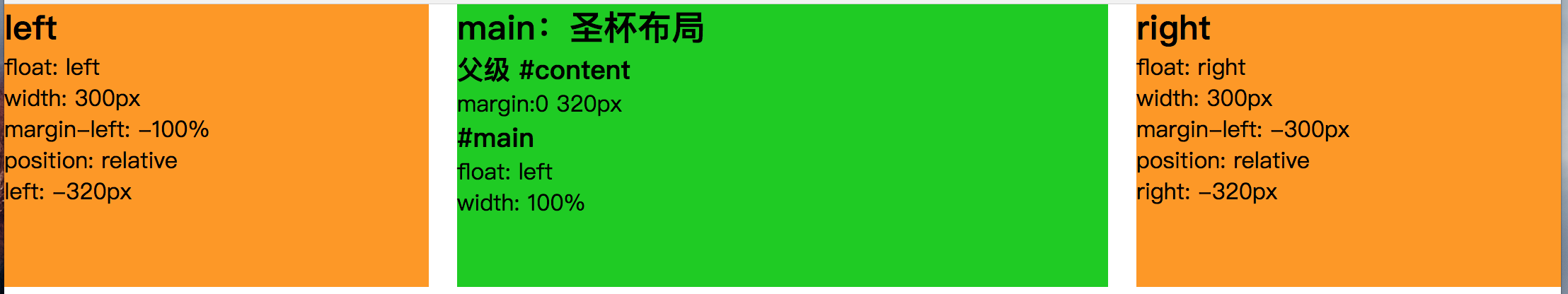
圣杯布局 (float + 负margin + padding + position)
圣杯布局 原理说明:
主面板设置宽度为100%,主面板与两个侧栏都设置浮动,常见为左浮动,这时两个侧栏会被主面板挤下去。通过负边距将浮动的侧栏拉上来,左侧栏的负边距为100%,刚好是窗口的宽度,因此会从主面板下面的左边跑到与主面板对齐的左边,右侧栏此时浮动在主面板下面的左边,设置负边距为负的自身宽度刚好浮动到主面板对齐的右边。为了避免侧栏遮挡主面板内容,在外层设置左右padding值为左右侧栏的宽度,给侧栏腾出空间,此时主面板的宽度减小。由于侧栏的负margin都是相对主面板的,两个侧栏并不会像我们理想中的停靠在左右两边,而是跟着缩小的主面板一起向中间靠拢。此时使用相对布局,调整两个侧栏到相应的位置。
圣杯布局 步骤:
-
三者都设置向左浮动。
-
设置main宽度为100%,设置两侧栏的宽度。
-
设置 负边距,#left设置负左边距为100%,#right设置负左边距为负的自身宽度。
-
设置main的padding值或者margin值给左右两个子面板留出空间。
-
设置两个子面板为相对定位,#left的left值为负的#left宽度,#rught的right值为负的#right宽度。
result display
1
2
3
4
5
6
7
8
9
10
11
12
13
14
15
16
17
18
19
20
21
22
23
24
25
26
27
28
29
30
31
32
33
34
35
36
37
38
39
40
41
42
43
44
45
46
47
48
49
50
51
52
53
54
55
56
57
58
59
60
61
62
63
64
65
66
67
68
<!DOCTYPE html>
<html lang="en">
<head>
	<meta charset="UTF-8">
	<title>test</title>
<style>
*{
	margin: 0;
	padding: 0;
}
#content {
	margin:0 320px;
}
#left, #main, #right {
	height: 200px;
}
#main {
	float: left;
	width: 100%;
	background: #00cd00;
}
#left {
	float: left;
	width: 300px;
	margin-left: -100%;
	position: relative;
	left: -320px;
	background: #f90;
}
#right {
    float: left;
	width: 300px;
	margin-left: -300px;
	position: relative;
	right: -320px;
	background: #f90;
}
</style>
</head>
<body>
	<div id="content">
		<div id="main">
	    	<h2>main:圣杯布局</h2>
	    	<h3>父级 #content</h3>
	    	<p>margin:0 320px</p>
	    	<h3>#main</h3>
	    	<p>float: left</p>
	    	<p>width: 100%</p>
	    </div>
		<div id="left">
			<h2>left</h2>
			<p>float: left</p>
			<p>width: 300px</p>
			<p>margin-left: -100%</p>
			<p>position: relative</p>
			<p>left: -320px</p>
		</div>
		<div id="right">
			<h2>right</h2>
			<p>float: right</p>
			<p>width: 300px</p>
			<p>margin-left: -300px</p>
			<p>position: relative</p>
			<p>right: -320px</p>
		</div>
	</div>
</body>
</html>
圣杯布局 notice
-
DOM元素的书写顺序不得更改。
-
当面板的main内容部分比两边的子面板宽度小的时候,布局就会乱掉。可以通过设置main的min-width属性或使用双飞翼布局避免问题。
-
以上#left设置margin-left: -100%是相对于父级#content的宽度,而不是自身宽度
圣杯布局 优缺点
- 优点:HTML 结构相对简单,可以优先加载内容主体。
- 缺点:样式定义稍微复杂
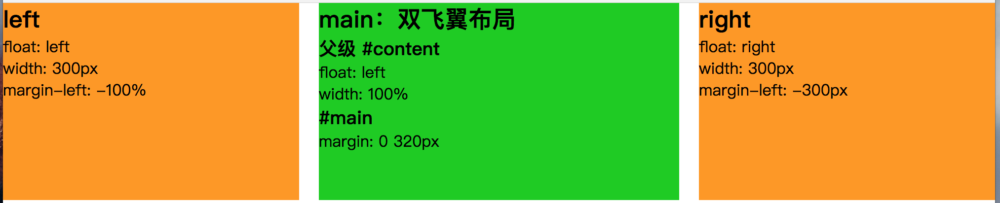
双飞翼布局 (float + 负margin + margin)
双飞翼布局 原理说明:
双飞翼布局和圣杯布局的思想有些相似,都利用了浮动和负边距,但双飞翼布局在圣杯布局上做了改进,在main元素上加了一层div, 并设置margin,由于两侧栏的负边距都是相对于content而言,main的margin值变化便不会影响两个侧栏,因此省掉了对两侧栏设置相对布局的步骤。
双飞翼布局 步骤:
-
三者都设置向左浮动。
-
设置content宽度为100%,设置两个侧栏的宽度。
-
设置负边距,left设置负左边距为100%,right设置负左边距为负的自身宽度。
-
设置main的margin值给左右两个子面板留出空间。
result display
1
2
3
4
5
6
7
8
9
10
11
12
13
14
15
16
17
18
19
20
21
22
23
24
25
26
27
28
29
30
31
32
33
34
35
36
37
38
39
40
41
42
43
44
45
46
47
48
49
50
51
52
53
54
55
56
57
58
59
60
<!DOCTYPE html>
<html lang="en">
<head>
	<meta charset="UTF-8">
	<title>test</title>
<style>
*{
	margin: 0;
	padding: 0;
}
#content {
	float: left;
	width: 100%;
}
#left, #main, #right {
	height: 200px;
}
#main {
	margin: 0 320px;
	background: #00cd00;
}
#left {
	float: left;
	width: 300px;
	margin-left: -100%;
	background: #f90;
}
#right {
    float: right;
	width: 300px;
	margin-left: -300px;
	background: #f90;
}
</style>
</head>
<body>
	<div id="content">
		<div id="main">
	    	<h2>main:双飞翼布局</h2>
	    	<h3>父级 #content</h3>
	    	<p>float: left</p>
	    	<p>width: 100%</p>
	    	<h3>#main</h3>
	    	<p>margin: 0 320px</p>
	    </div>
	</div>
	<div id="left">
		<h2>left</h2>
		<p>float: left</p>
		<p>width: 300px</p>
		<p>margin-left: -100%</p>
	</div>
	<div id="right">
		<h2>right</h2>
		<p>float: right</p>
		<p>width: 300px</p>
		<p>margin-left: -300px</p>
	</div>
</body>
</html>
双飞翼布局 notice
-
双飞翼布局解决了圣杯布局main的最小宽度不能小于左侧栏的缺点。
-
双飞翼布局不用设置相对布局,以及对应的left和right值。
双飞翼布局 优缺点
- 优点:可以优先加载内容主体。
- 缺点:HTML 代码结构稍微复杂点
summary
-
传统的布局方法基于盒状模型,依赖 display属性 + position属性 + float属性,实现复杂,但浏览器兼容好
-
圣杯和双飞翼布局处于过渡阶段,了解即可。
-
拥抱flex布局,展望grid网格布局。
去掉高度已知,哪种方案还可以用
flex 和 表格布局 还能表现完美
页面布局的延伸-layout
- 常用居中方法
- 水平居中
- 垂直居中
- 水平垂直居中
- 单列布局
- 上高度固定,下自适应
- 下高度固定,上自适应
- 上下高度固定,中间自适应
- 两栏布局
- 左宽度固定,右自适应
- 右宽度固定,左自适应
- 三栏布局
- 左右宽度固定,中间自适应
- 等分布局
- 等高布局
- 响应式布局
building…
